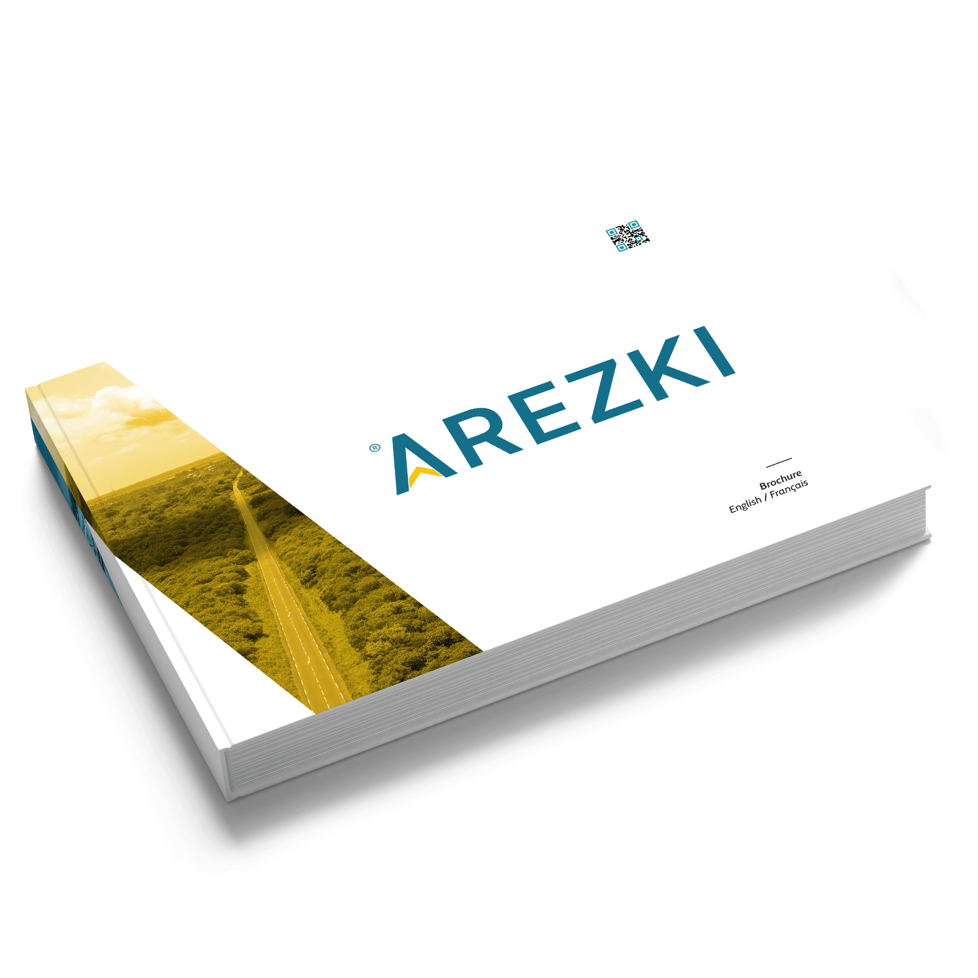
Mission
Creating a new brand identity to better reflect Arezki's values and goals, and redesigning the website alongside all other marketing materials.
The project required working with a team of professionals: CEO's, General managers, and Project managers
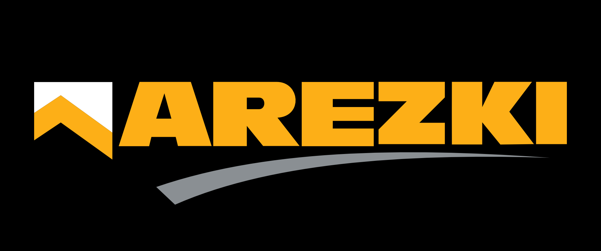
Old Version Logo
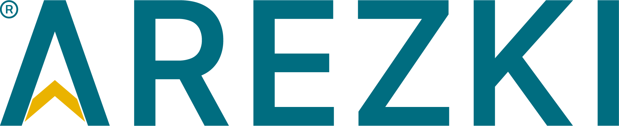
Freshly Rebranded
Strategy, Objective, & Values
Arezki is a well-established brand with over 60years of experience in the business. With the current company’s logo, a trust has been built with the clients along the years. But, with the rising technology, an upgrade must be considered to keep up with the modern criteria and standards specially when it comes to the digital world.
The following re-branding focuses on the company’s main target that is about maintaining trust and to keep providing the market with the highest service quality and best experience. Stay true to original, but contemporize.
The core idea is enhanced by the creation of the brand icon A, the new brand colors, and the three elements of Arezki’s successful story that are innovation, growth, and excellence.
Logo & Identity
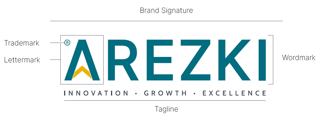
This rebranded logo design of Arezki refers to a combination two logo types, the lettermark and the wordmark. The lettermark type, it is a typographic symbol representing the company through the use of its initials or the brands first letter. So, the single letter A, can be used as a mnemonic device for the company name. In addition, the illustration of the letter A is embed in the company name to create the wordmark logo and still be read Arezki.
Advantage:
The use of this logo type combination, simplifies the logo and allows it to fit better in a variety of space sizes, easily scalable, increase recognition, and makes it ideal for app icons and many digital and prints uses.
Color Palette
Petrol Blue Gold Grey
Brand Mark
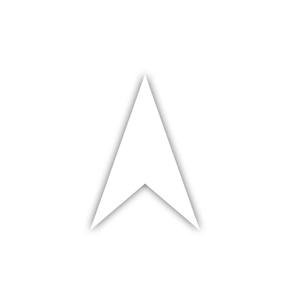
Architectural illusion Illustration
- Minimalist abstract illustration of a building standing tall with its sharp edged shadow.
- The flat head of the building refers to the roof, while the sharp edge of the shadow refers to a meeting point of an endless road.
- The shape is symmetrical that has identical double sides, it can be flipped horizontally as a mirror.
- The Registered trademark ®is placed on the top left side of the logo to ensure on keeping balance.
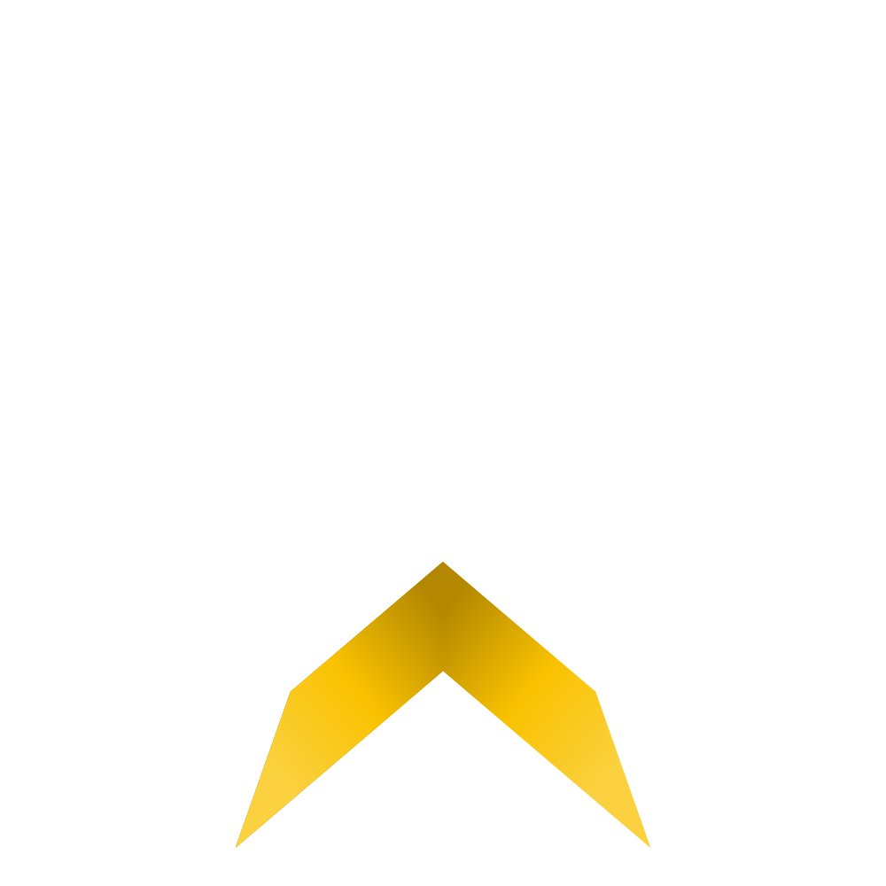
Concept & meaning
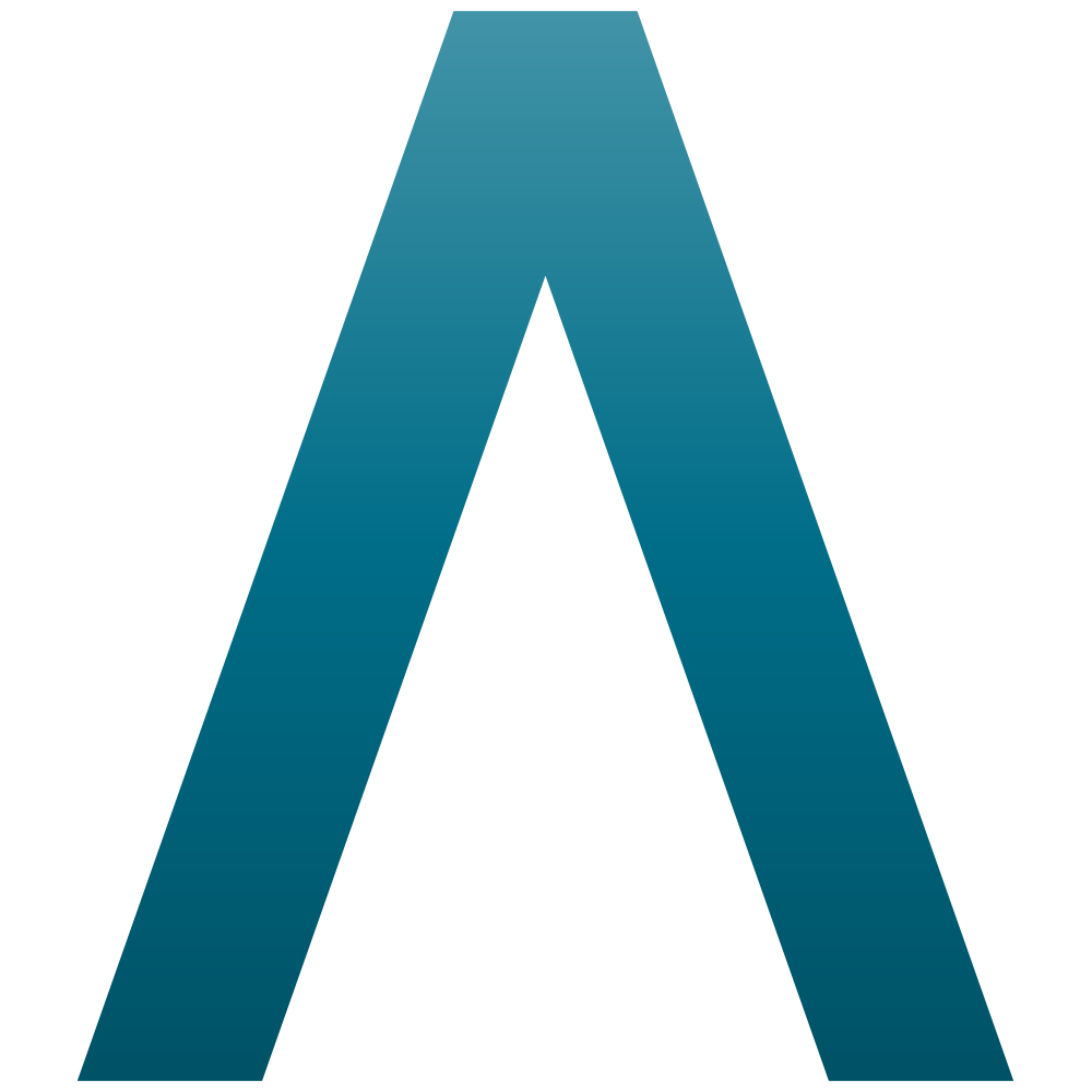
- Inspired from the pyramids & illustrated as an arrow. The letter A represents royalty, history, strength, power, &evolution.- As represented in the logo tagline, the company has three key values that are; innovation, growth, and excellence. And these values are successfully embedded in the logomark as three arrows in one.- The blue shape represents the innovation. The gold one represents growth. The colorless represents the excellence.
3D Logomark
Corporate Materials
UX / UI
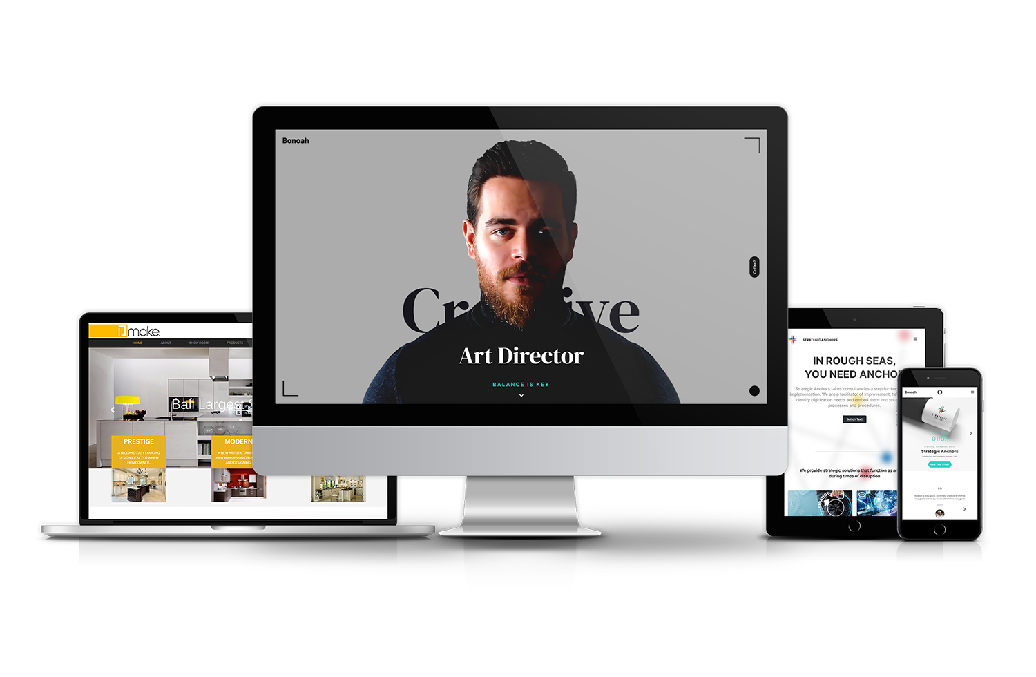
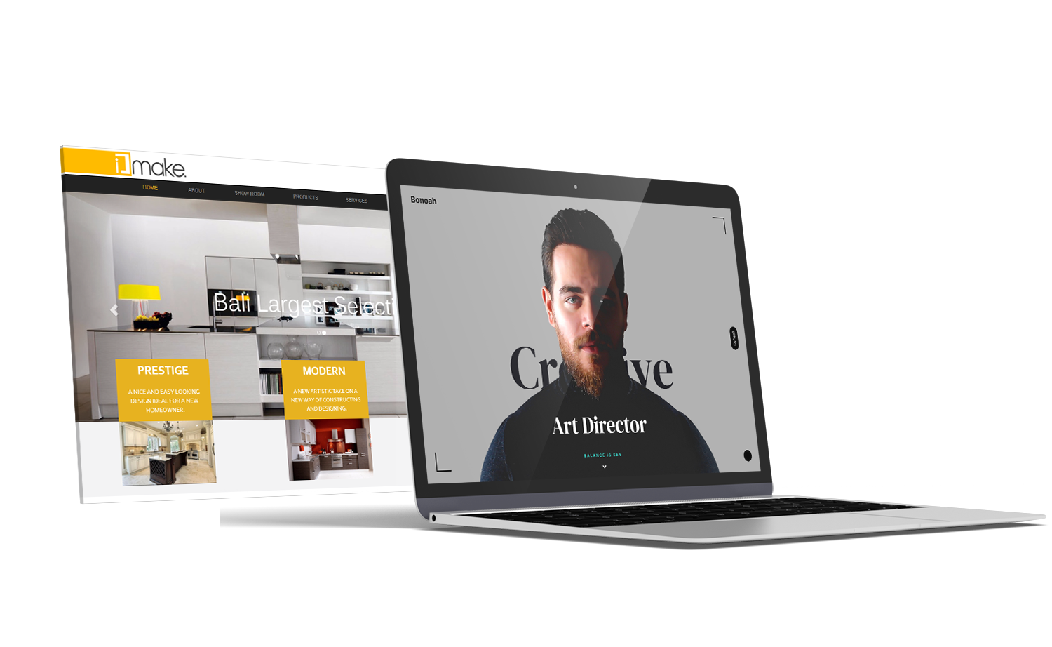
A modern user-friendly multi lingual website. Designed and developed by me Bonoah.
www.arezkigroup.com
Back to projectsMission
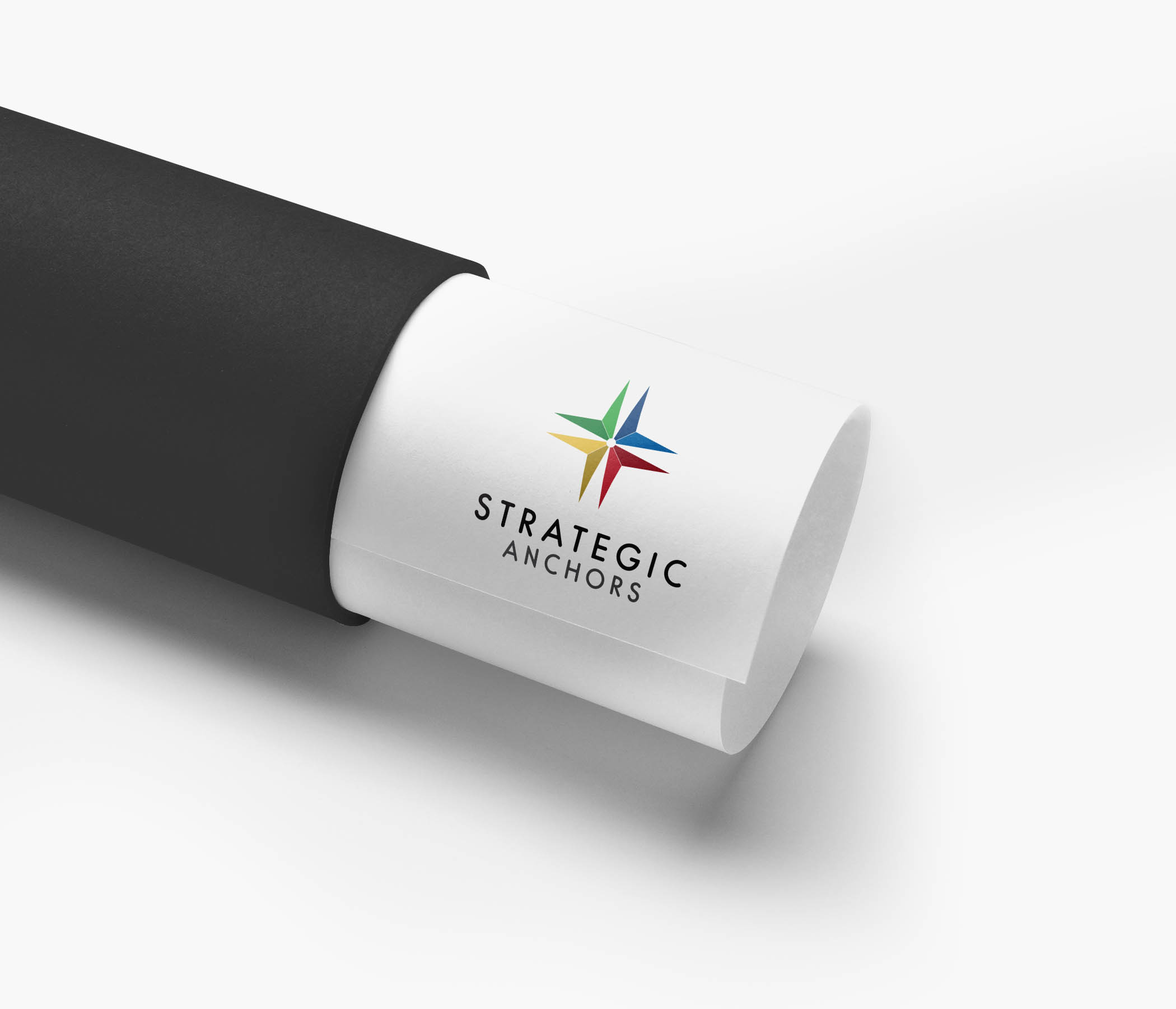
Create a solid identity for strategic anchors and rebuild all visuals
Old Version Logo

Freshly Rebranded

Idea & Concept
Strategic Anchors company is all about construction, technology, and facilitating the work for their clients with the modern tools. For the logo I wanted to create something futuristic, so I illustrated an anchor inspired from a minimalist 3D-shaped skyscraper, connected with a strategy at a focus point to form a star. The star concept, represents high values and guarantee a lifetime success to the brand.
The white space is playing the main role in this branding, since it sums up the brand colors, just like what a color wheel would do, and pile up the anchors composing a star icon. When we connect the stars in the upper space, we can get an abstract architectural buildings, strategy.

Color Palette
Strategic Anchors had originally been a colorful brand, so for that matter I preferred to highlight the company’s values with these four colors.
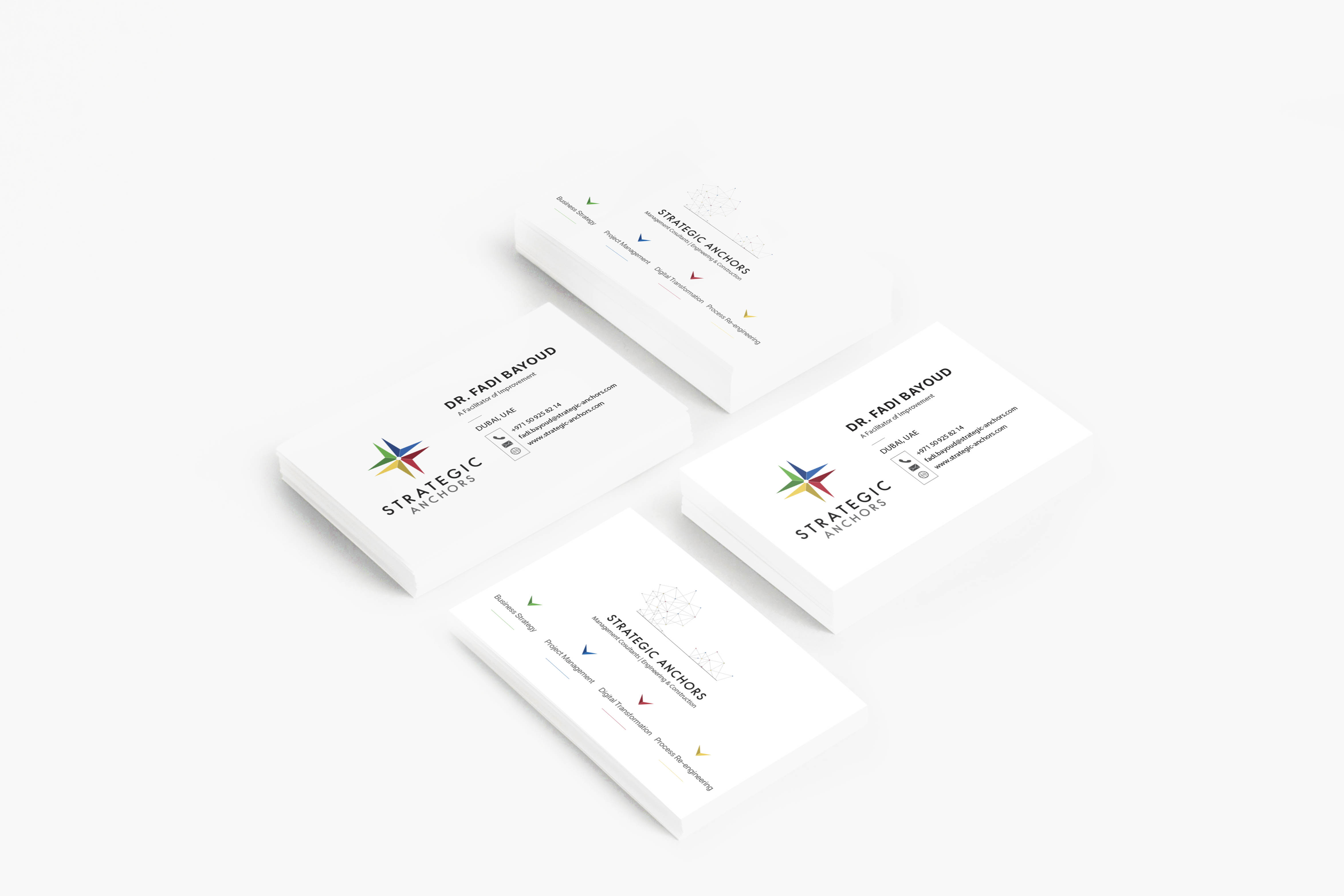
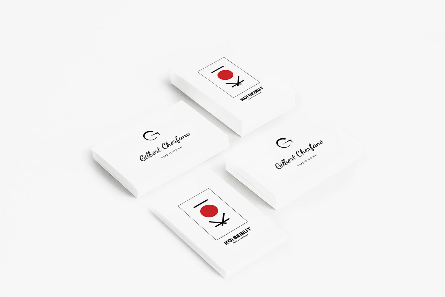
Stationary
Business card
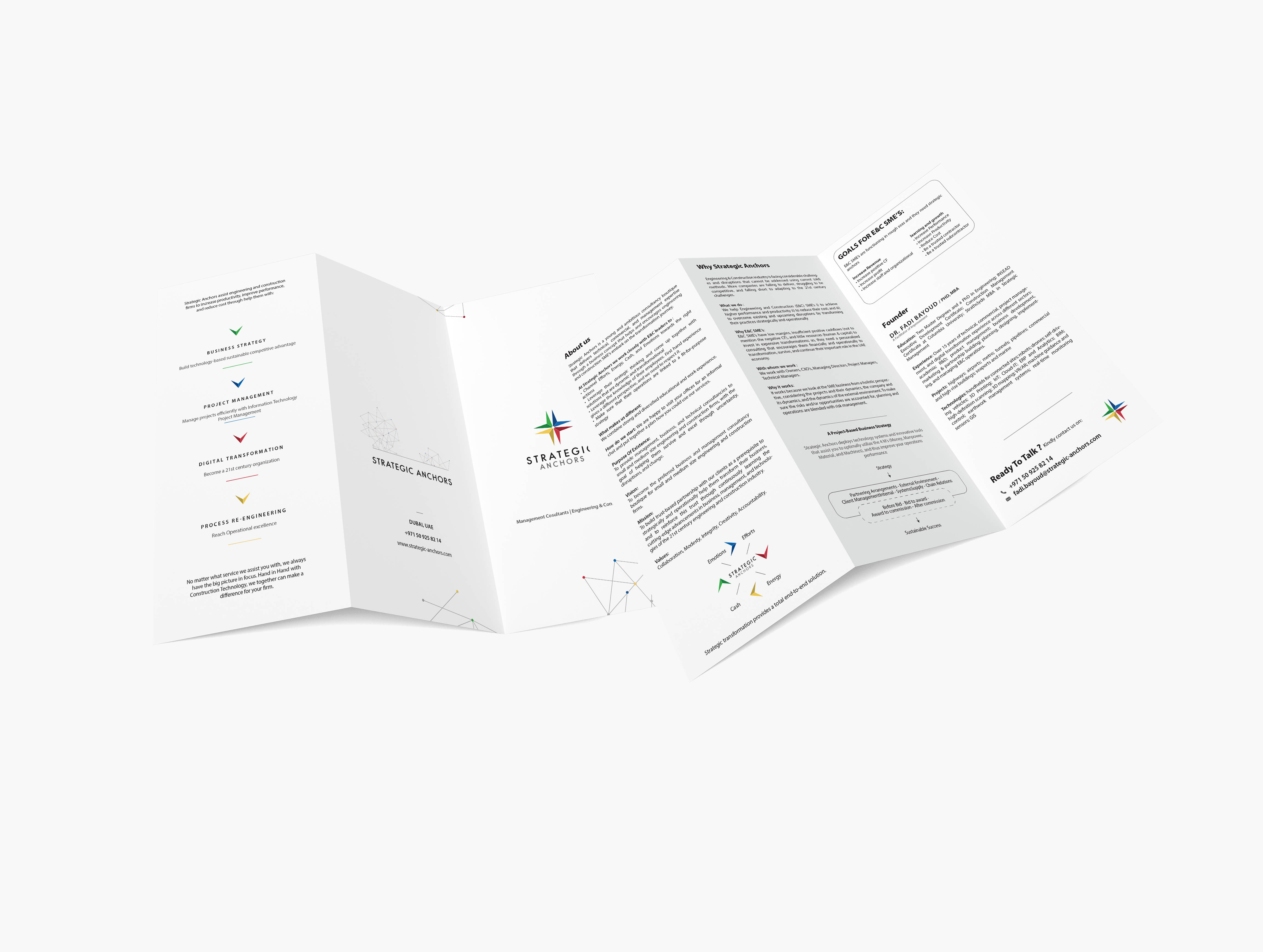
Trifold company profile
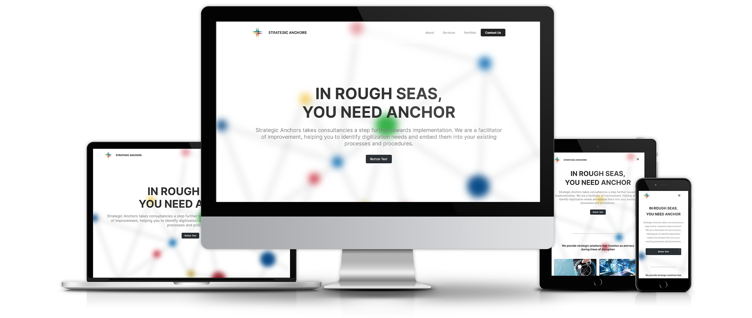
UX / UI
For Strategic Anchors website I recently have finished with the user experience and started with my signature user interface that will have the same style as my website.
 Back to projects
Mission
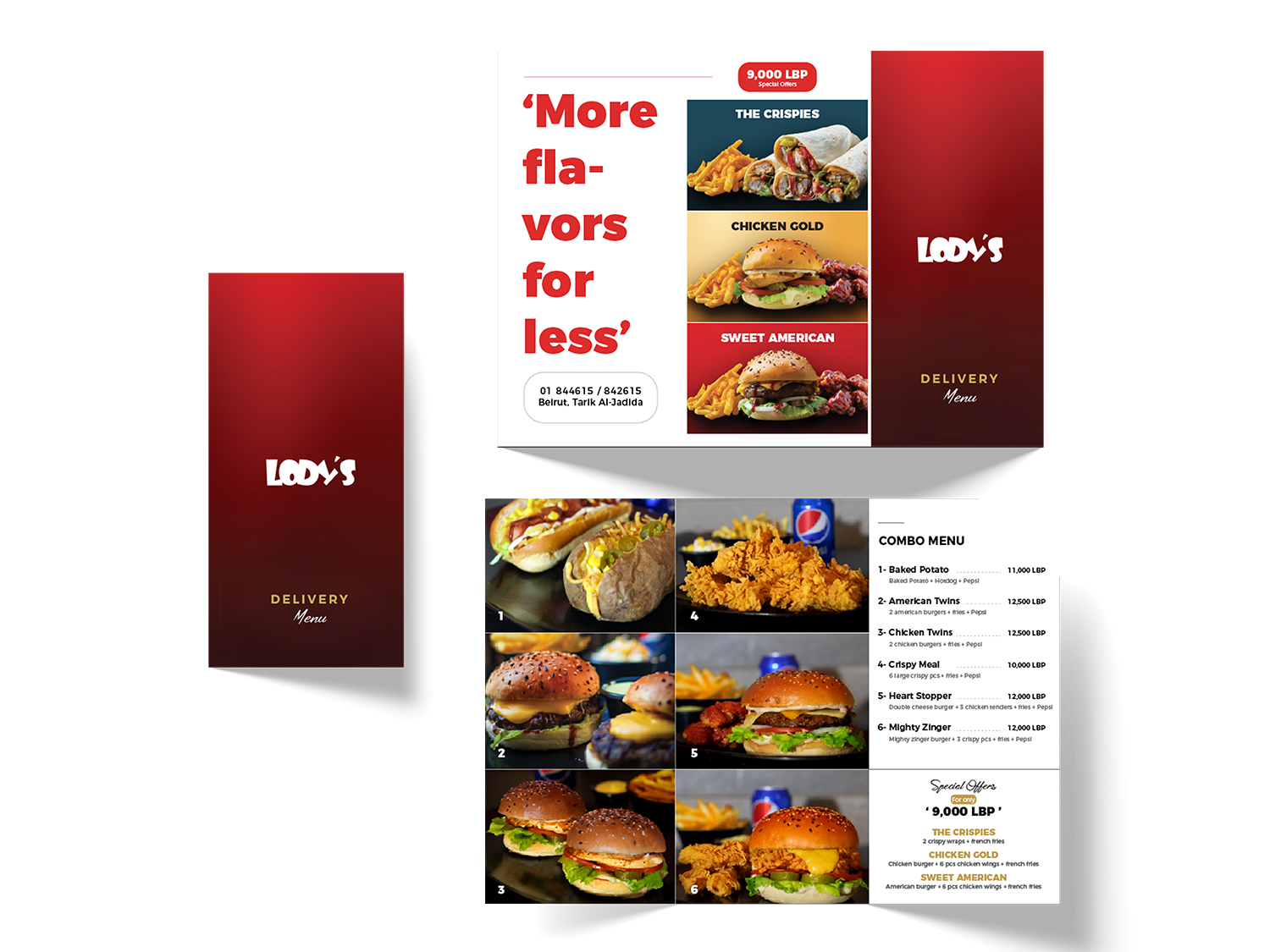
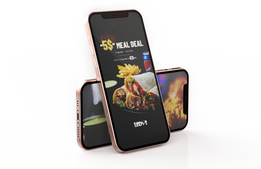
Creating strong visuals and enhance sales through strategical campaigns using push marketing tools between the years 2017 and 2020.
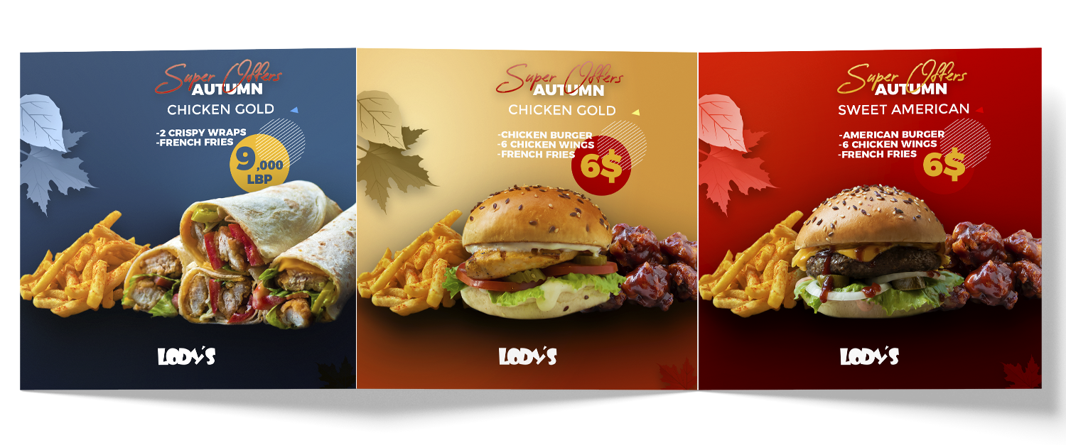
October Campaign 2019
Starting off the season with attractive offers, using the autumn main elements like colors oil colors and leaves. I was responsible for strategizing the campaign aspects and doing the photography and graphic design work as well. We promoted for these offers on social media, billboards, and printed leaflets. The campaign was successful enough to get significant sales increase.
 Back to projects
Mission
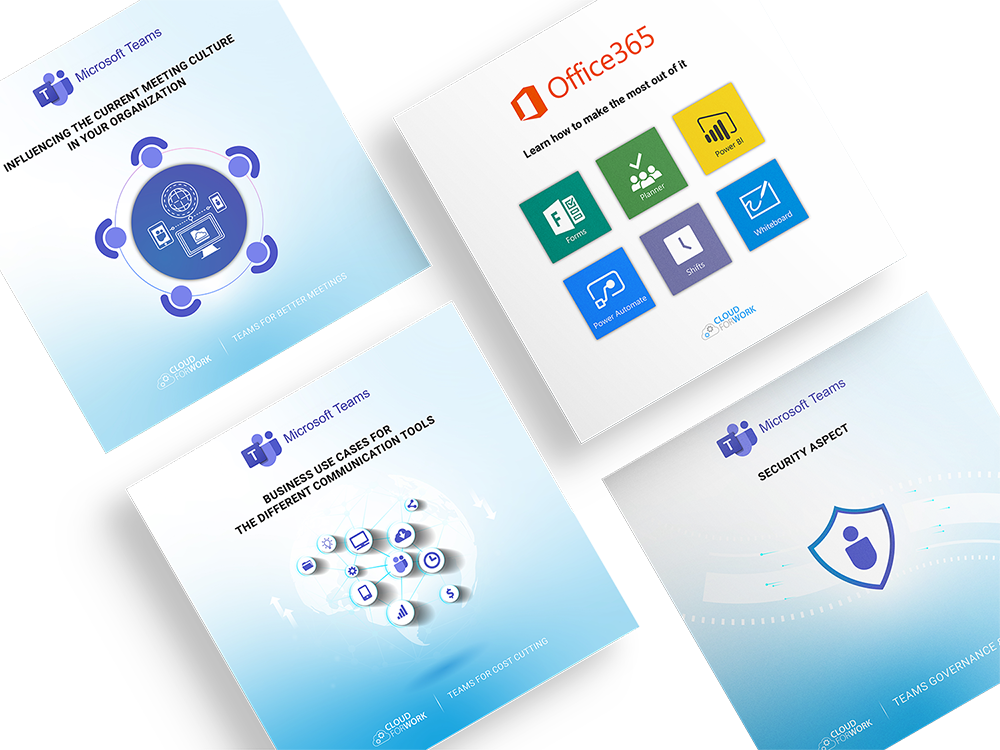
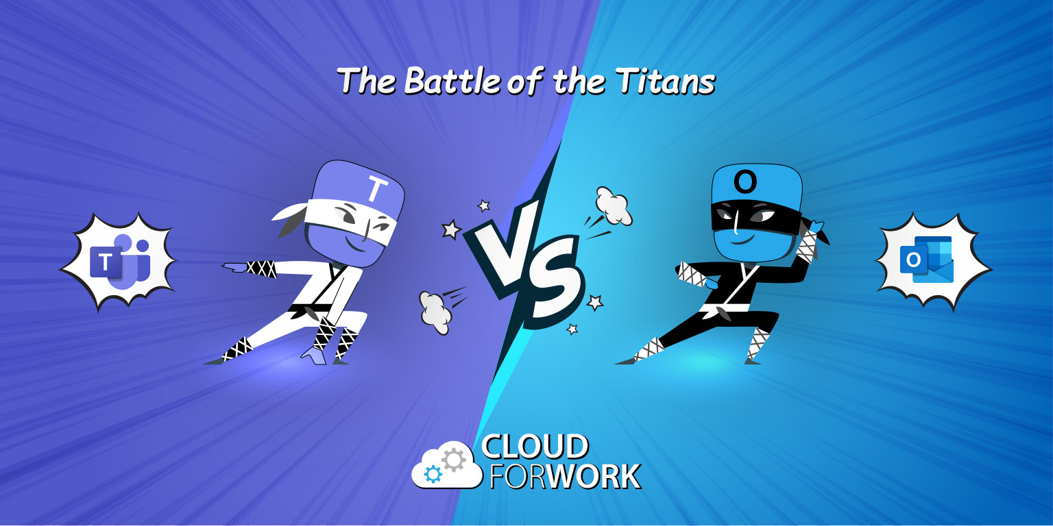
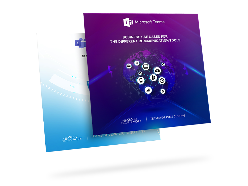
To help Cloud For Work company translate it's evolutionary ideas into graphic work that keeps the company ahead from competitors, like designing more than 40 Microsoft courses, educational presentations, certificates, and html responsive email templates.
 Back to projects
Mission
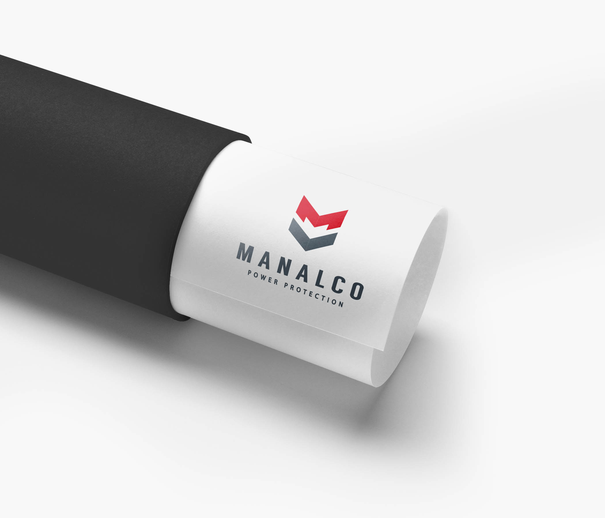
Provider for critical power needs. With the adequate resources to support any operating facility (firm, bank, hospital, factory… etc). The mission was to create a solid identity for Manalco company and rebuild all visuals.
Old Version Logo

Freshly Rebranded

Idea & Concept
Entering the digital world and online advertising was the main motivation for Manalco for hiring me to recreate the brand identity and all the necessary visuals. The idea was to create an icon for the brand that presents the company's profile and also highlight the letter M, and the full shape was inspired by the cubic form of the ups.
Defined Icons

Solar Energy

Solar Energy

Solar Energy

Solar Energy

Solar Energy

Solar Energy
Stationary

 Back to projects
Overview
Where I started
I've handled my first web project back in 2015, back in that time we were still getting used to the booming of smart phones and websites weren't responsive enough to handle the boom. The project was governmental and had to be informative, so I had some limitations with being artistic and had to go with the old stiff design trends.
The project is currently off and undergoing a redesign, click here to view the project
Where I'm now
With the beginning and the rise of covid-19, I've wanted to gain some major new skills while having so much free time at home during lockdown. I was curious to see if it's possible for a designer to learn how to code and build a fully responsive website professionally on their own. Then I've started with Webflow courses and things escalated quickly to a level where I got able to create my own user interface signature and implemented it in my own portfolio website.
I've got a wide knowledge in css styling and transforming my simple motion graphics into json files and embed as smooth interactions in the user interface.
 Back to projects
Logo Design
Gilbert Cherfane
Director, Producer, and Video editor
Time is the first thing that comes to mind when thinking of a film project. Since its the link between the image and how how it’s developing through out the editing process, a timeline. The challenge part in this project is to create a minimal icon that can show time and related to the name at the same time. Thus, I’ve combined the letters G & C with a cool clock and it’s hands in motion.
KOI
Lounge sushi bar & grill
When hearing about sushi, the first thing that I picture in my head is the complex Japanese language and how it's written upside down, beautiful isn't it?. For this project I wanted to show some true Japanese identity for this bar, which is creating a type face from sticks, highlighting the Japanese famous red circle in the flag along with the negative space, and finally presenting it upside down like a letter!
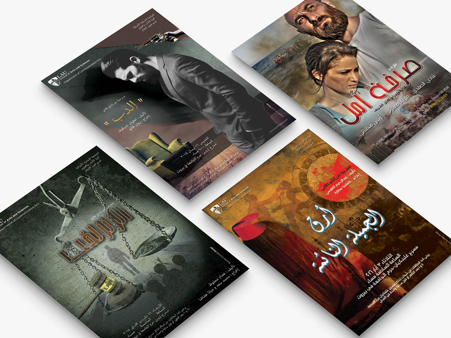
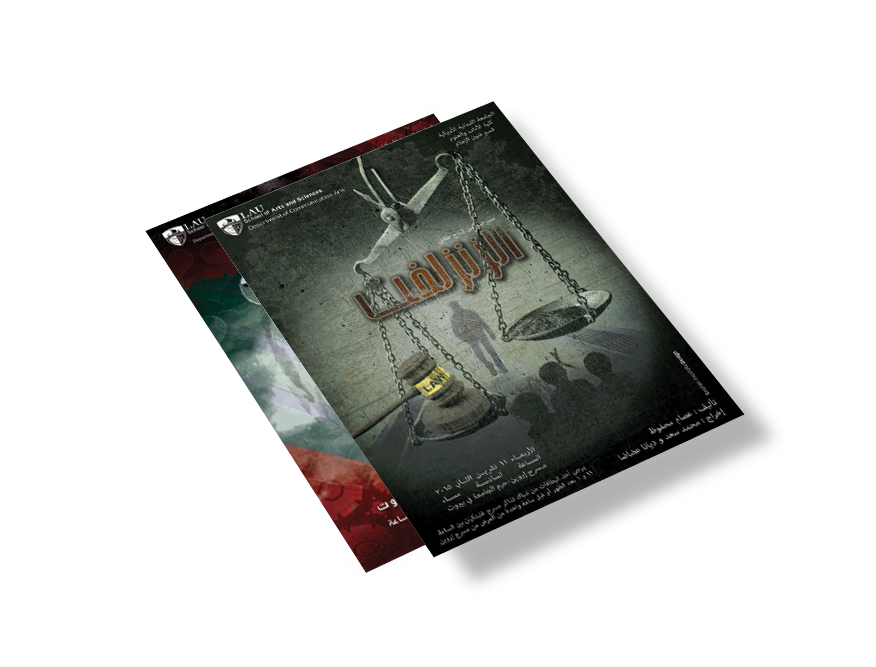
Poster Design
 Back to projects


.png)


.png)